Friday, 16 January 2015

Project 02 - Grotesque Gargoyles

I was searching for the difference between gargoyles and grotesques when I happened across the artist 'Liu Xue'. She creates realistic looking sculptures based on anthropomorphism. Like many gargoyles and grotesques, they fit into the uncanny valley which gives them a creepy vibe.
I'd like to experiment with anthropomorphism like this. The animal appendages are all connected in such a way that they'd make sense anatomically. I think this is important if you want to create a creature which feels life-like.


The only difference I can find between gargoyles and grotesques is that gargoyles are made with a spout in mind in order to convey water from a roof. Grotesques however, have no spout.

Thursday, 8 January 2015

Project 02 - Initial research

When I read the theme my initial thoughts went to the series of emails between Greg Wohlwend and Asher Vollmer documenting the development of the iOS game 'Threes'. I read through the whole thing over Christmas break and one of the things which stuck out to me was the 'Argoyles' idea; monsters/gargoyles with argyle patterns (which they didn't use in the end).
A mockup of the old art-style in-game.

Reading about their design process was incredibly interesting. The huge number of re-iterations really shows how much work goes into this level of quality. 

If you'd like to read the documentation you can do HERE

Argyle is such an attractive pattern it makes me want to use something similar in my own design.

I was thinking I might juxtapose a cute wooly jumper and hat on the traditional hideous monster/gargoyle or something of the sort.
Can you make gargoyles from fabric or do they have to be stone?
     - Something to research


I've been researching into traditional gargoyles and I found THIS website. Here are a few quotes:

"Gargoyles were placed on the roofs of Egyptian temples where their mouths served as a spout for water."

"...saved his country from a monster by the name of Goji, sometimes called Gargouille. Supposedly the monster was so scary looking that it frightened off evil spirits. This led to some calling the monster a protector and placing similar carved pieces on churches and other important buildings."

"Starting in the 19th century, gargoyles became more of a decoration than anything else."

"...gargoyles were used on more modern buildings as a form of decoration"

Summary:
Gargoyles have been around for thousands of years and serve as a spout for water. They supposedly look scary because of a monster from an old folk tale and they were made because of their association with protection. Since the 19th century their use has been mostly decorative.

We haven't been given a time period for this project so I feel like I could go old school and create something really scary looking or I could go modern and create something with novelty value. Perhaps I could even look at futurism in which case I should probably look into some of H.R.Giger's stuff.

A lot of monsters are based off of real life animals or combinations of them so I might use that as a starting point. Most gargoyles I've seen seem to be animal-like in some way or another although it would be really cool to experiment with the abstract too.

I also found THIS WEBSITE

The first section about etymology:

The first paragraph says that gargoyles can often be in the form of just faces, which is something I might look into further.

The second paragraph backs up my finding about the animal-like features most gargoyles seem to have. It also talks about how they're "often very imaginative and/or grotesque".

The third paragraph talks about how in recent years, the word 'gargoyle' has changed/widened to include "cartoon characters" and "any ugly or grotesque creature particularly if it lives on buildings or rocks." which might allow me to experiment with cuter, more cartoon-like designs too. Perhaps I could then juxtapose that with something scary and more traditionally gargoyle-like such as this:


http://www.odditycentral.com/tag/creepy

Project 02 - Introduction to Gargoyles

Our brief is to "develop and create a game ready Gargoyle sculpture in the style of your choosing."

It must be "suitable for use in a CURRENT GEN platform game (XBOX ONE/ Playstation 4/ PC)"

"The Gargoyle will be non articulated statue and will NOT be animated"

and "You must demonstrate efficient topology within the final asset, which must also be textured."


This is very clever brief because it allows us to create a character without having to worry too much about how it'll deform. Although we'll have to consider the topology of the model, it'll be focused around keeping polycount low rather than how it might animate.

I'll be using Maya and Zbrush for models with Photoshop for the textures. I'm expecting to do a lot of traditional drawing for initial ideas and iteration. I might re-use my procedural silhouette generator for ideas too.

Wednesday, 19 November 2014

Project 01 - Applying Composition,Llight and Colour to Environments

This environment piece has many light sources. I've shown the diffused moonlight refracting off the mist and causing soft lighting on the surrounding trees. I've also used harsher lighting on the trees from the firefly spotlights. I've used a range of blues to reds on the trees in order to give the environment a mystical vibe and used mostly blue and white lighting to evoke a sense of cold into the viewer. I've also used thin harsh highlights on the trees imply bark along with softer shadows and highlights to show form. 
I've intentionally composed the image so that the root from the tree on the right leads the eye along itself and up the trees shadow towards the cave


Monday, 17 November 2014

Project 01 - Life Drawing

This is a 45 minute sketch from one of our life drawing sessions. The photograph doesn't really do it justice but this drawing was done on A1 paper. I'm fairly happy with how it turned out. It looks better in real life because you get more of a sense of the foreshortening when you're looking at it flat on a table. The proportions are fairly good but I think the hand and arm on the left looks a little too big relative to the hand and arm on the right. Or perhaps the one on the right is too small?

The legs give the image a good sense of depth and I think the pose has a good deal of detail to it. Shame I didn't have time to get the sketch to a point where I'd have been comfortable adding shading.

Sunday, 16 November 2014

Project 01 - Procedural Silhouette Generator (PSG)

For Proc Jam 2014, I decided to work more into my random silhouette generator so that it could actually be used a tool for developers.

I've improved the interface hugely and the player now has much more freedom in how their silhouettes turn out. You can download it using this widget:


Saturday, 15 November 2014

Project 01 - Rise of the Videogame Zinesters

I read Anna Anthropy's 'Rise of The Videogame Zinesters' recently. It was a very good read. I knew about Anthropy's work previously but this book gave me great insight into her opinions on the gaming industry. She has convinced me that absolutely everyone should make games as a form of artistic expression and it still bewilders me why it's still not accepted as so, at least not as humbly as the art industry accepts film as one of its own. Nevertheless, Anthropy has definitely gained a place on the wall of developers right next to Jane Mcgonigal and Mary Flanagan who I know share similar opinions.

Wall of Game Developers (The ones in red are just work reminders)
I use the wall of game developers to help me to remember visually the names of various developers as well as audibly. I can currently recite about 50 off the top of my head. Obsessive? could be.

Nevertheless, I recommend 'Dys4ia', 'Triad', and 'Mighty Jill Off' as they're my 3 favorite Anna Anthropy Games.

Thursday, 13 November 2014

Project 01 - Light and Colour analysis

The contrast between light and dark in this image is very apparent. Immediately you can see that the artist has great sections of dark to push the focal point onto the two figures which stand out from the rest of the image because of their contrasting colours. A lot of blue lighting has been used in the image to exaggerate the coldness of the environment. 


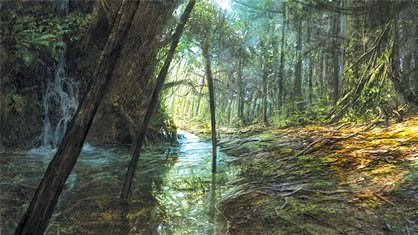
Here, there is a strong contrast between 'warm' colours and 'cold' colours in order to create a vibrant image. You can really feel the warmth of the diffused light rays coming through the tree tops. The harsh reflection in the river acts as a guide to guide the eye upwards and give the piece depth.

Saturday, 8 November 2014

Project 01 - Applying Compositions to My Own Environments

In this environment concept thumbnail you can see that I've attempted to combine the 'Iconic' composition in the bottom half of the image with the "L" composition running up the right side and along the top of the image. This focuses the viewers eye up the road in the middle of the image in order to get a sense of the business of the location before moving down towards the figure on the left in order to show the contrast between it's quietness.

Thursday, 6 November 2014

Project 01 - Composition Analysis


In this image, you can see that the artist has used the Fibonacci sequence in their composition causing the focus to move around the image in a spiral until it hits the area just above the ladder. The image also has a vague but apparent "L" composition running along the negative space at the top and down the left side behind the hanging apparatus. This composition draws the eye towards the top of the step ladder also, complimenting the other compositional technique.


The artist for this image has used the rules of thirds for their composition. You can see how the pillar lines up with the two points on the left and the transition from light to dark on the wall marks the other two points, with the corner lining up almost exactly on the point. This composition draws attention away from the figure in order to focus on the environment and potentially distracting the viewer from the potential doom she might face. I believe that initially the viewer is supposed to be of ignorant of the snake as the figure, helping us the empathize, causing the image to be more effective in its story telling.

Tuesday, 4 November 2014

Project 01 - More Research

I'll be making some character and model sheets very soon along with environment concepts so I've been researching what these should/might look like.

The Witness, Jonathan Blow - http://the-witness.net/news/2010/02/concept-art/


A birds eye view has been chosen in order to show as much of the area as possible in one image. The general colour palette has been chosen beforehand and has been included, perhaps for other concept artists to refer to or perhaps for modelers to refer to. Nothing is completely black or completely white.


 A worms eye perspective has been used here to amplify the height of these steps. There is a noticeable contrast between cold blues and warm yellows causing the image to look very vibrant.

 These less detailed concepts have been compiled in to get a comparison for the overall colour schemes and feel for the games environments.


The Binding of Isaac, Edmund Mcmillen - scans from the concept art book included with the 'Unholy Edition' of the game
 This early character sheet shows 'Gurdy' at varying levels of detail during various situations. Expression has been used to show the feeling of the character and motion lines have been used to show how the character moves.

The Last of Us - Naughtydog - screenshots from the in game concept art section

An off white background has been used here so the artist can paint highlights into the image. The way Joel and the fireplace break the implied border creates a sense of depth, height and perspective. The piece shows emotion between the characters, showing the state of their relationship to one another.


This environment piece shows the state of the city whereby the game is set. The abandoned cars, ripped flags, and excessive foliage strongly imply that the place has long since been abandoned. The acute lighting angle shows that this image takes place some time during the early morning or early evening.

Sunday, 2 November 2014

Project 01 - Some iterations

These are all iterations I made on top of my randomly generated silhouettes


I like the pose I've achieved here. The line work is pretty good to. The proportions aren't bad but I can tell that somethings not quite right.
Value. I'm going to keep the hair completely white.


The addition off walls gives the piece a good perspective. I quite like the colours but the walls are a bit plain. My textures are pretty bad. I think I'll consider this piece a step towards a final piece rather that a final piece in its own right.
I think I can do better.

Project 01 - More drawings

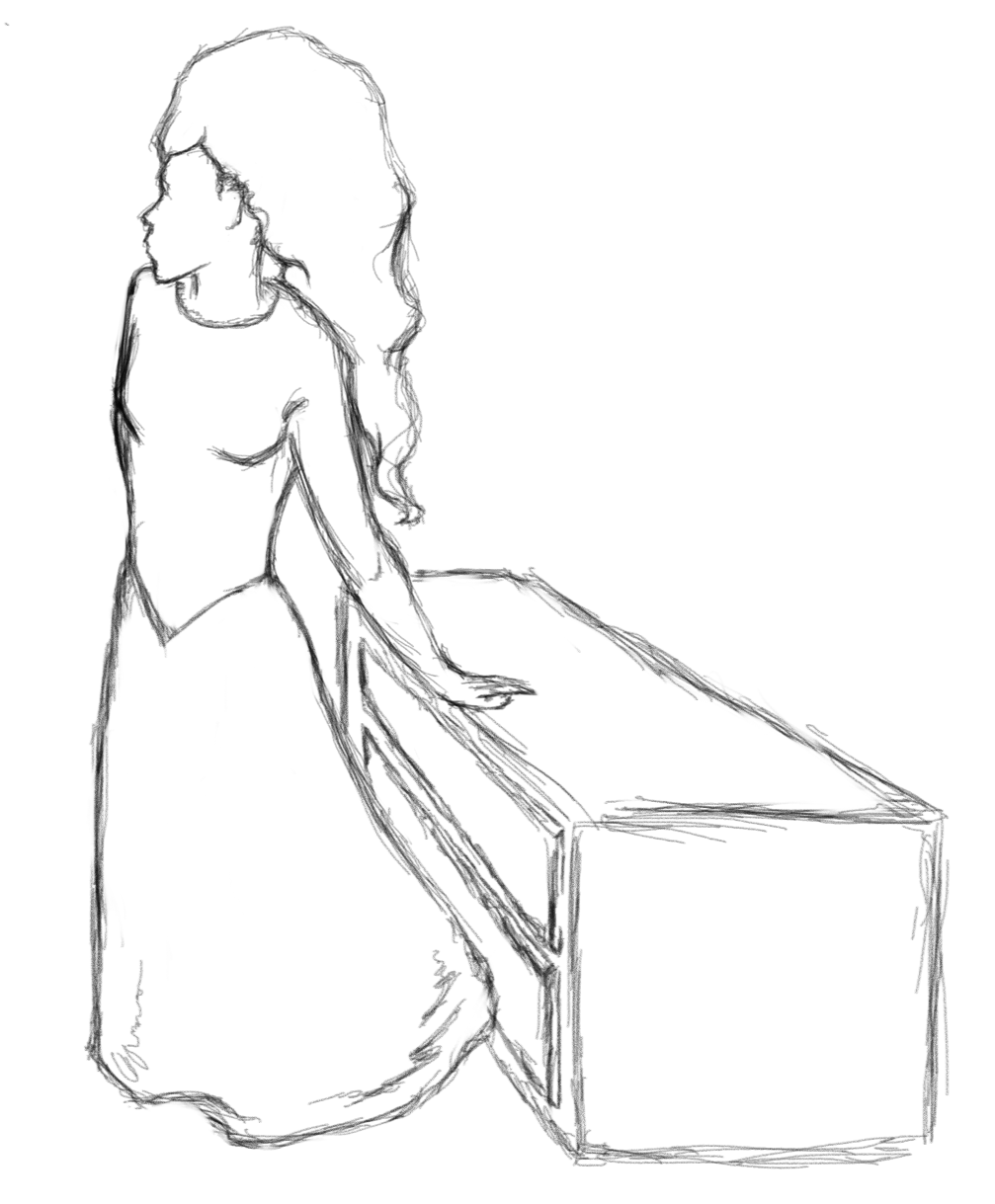
Here are some drawings (not from reference) of what I imagine the witch might look like. They were all done fairly quickly.

I was always taught not to do sketchy line work but I honestly really like how it looks.

 The witch is looking particularly suspicious here
Looking more Native American here. That's unintentional.

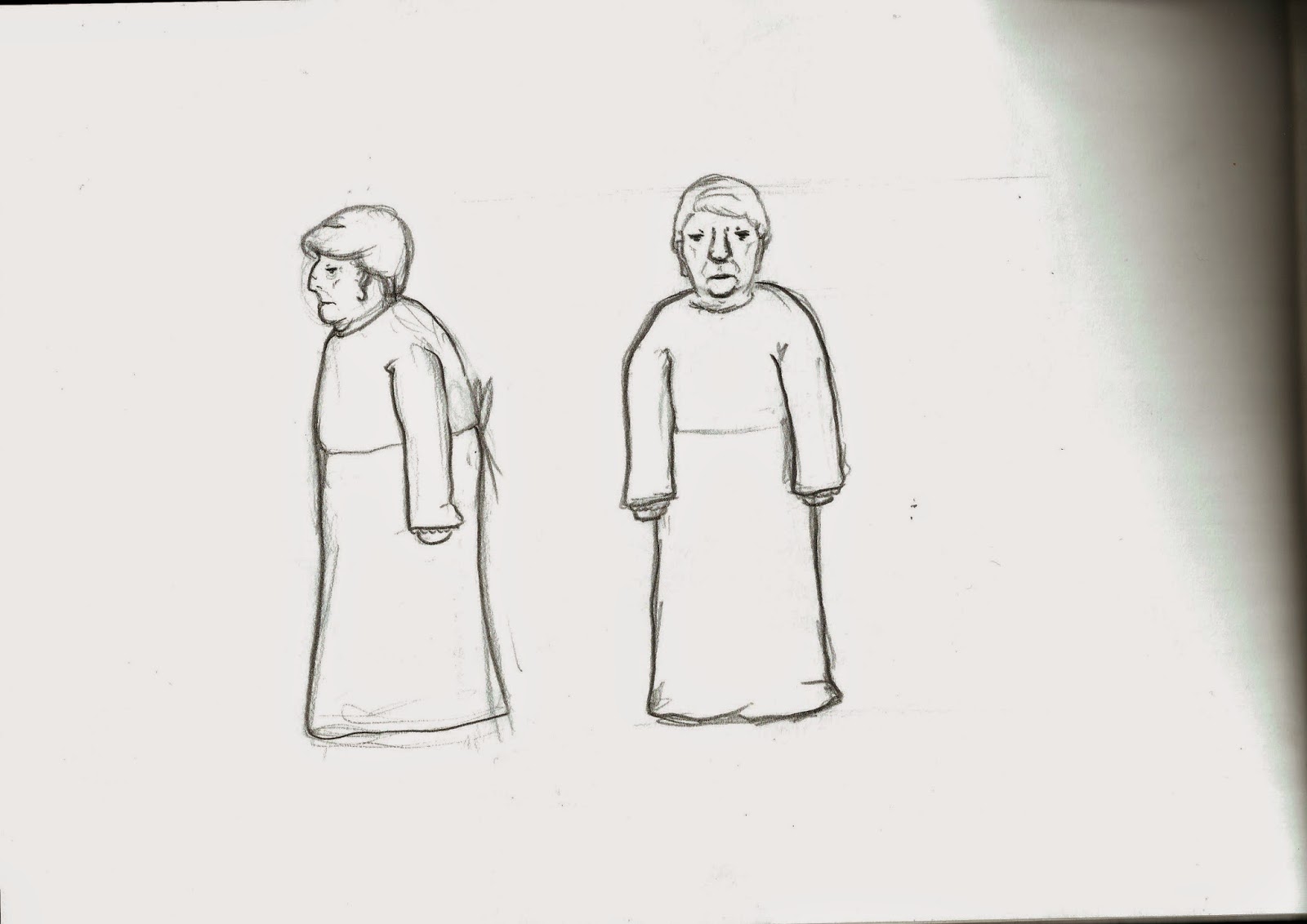
A friendlier looking witch. She's also a grandmother.


A quick model sheet to get a more well rounded idea of what she might look like

A younger variation on the witch

 I think I'd like the witch to be a jealous maid working for the royalty. Since the rich were RICH, and since a maid would be constantly exposed to all their luxuries, it wouldn't be surprising if she were extremely jealous of their glorious lifestyle.

Friday, 31 October 2014

Project 01 - Marie Antoinette

I watched Marie Antoinette (Film, 2006) today. It gave me great insight into 18th century fashion. I took many screenshots of the film which I cannot upload due to the file size (even when zipped).

I also drew people from the film as it was playing as well as when it was paused.


I love this pose. Interestingly, the clothes look like 1930'sish America even though they're Georgian.


Georgian hair is great. It should come back into fashion.


There were very few good shots of maids in the film, I got this one though.


 This took about 5 hours in total.
It seems there are very few older maids in the household in both this film and in Pirates of the Caribbean. I might consider changing my Witch design to a younger lady.
Afterwards, I applied what I'd found out about hair, clothing poses etc to my own drawings:


I like the hair and the hat here


Because of how much more research I have into the royalty over the maids I'm veering more towards making The Princess my character of choice. 

Or maybe the Princess and the Witch are the same character in some crazy plot twist. That could be interesting but I'm not sure how I'll justify it other than "It could be interesting...".

Thursday, 23 October 2014

Project 01 - Random Silhouette Generator

HERE is a link to my Random Silhouette Generator (windows only)

I made it in GameMaker: Studio 

Controls:
spacebar - generate a new silhouette
left shift - increase opacity
left control - decrease opacity
A compilation of silhouettes I generated using my silhouette generator
You can see how the generator has changed/ improved through the silhouettes as I was tweaking the shape placement, number of shapes, opacity etc...

The way the generator works is it creates a random number of shapes (within a range), the shapes then randomly turn into other shapes (for diversity), They then move their point of origin to a random x and y axis within the canvas, they spin around a random number of degrees and deform their height and width by a random variable (within a range) too.
Since the random number generator in game maker always chooses the same numbers, the software results in the same 'random' shapes every play, unless I change an argument or variable slightly between plays. Since then I've also added another variable that increases every step by 1 until it hits 11, at which point it returns to 1 again. This way, the player unknowingly has an influence on the generation of the shapes. Since it's almost impossible to time something to 1/120th of a second, the player should get different shapes every play. 
There is a 1/10 chance of getting the same first shape, but that probability reduces exponentially every shape the player makes and even then, it's not a big problem. 
Here are some more silhouettes
I like these silhouettes much more than the ones I painted in photoshop. They're more original and the way the opacity causes the shapes to darken in the center looks very nice. I haven't ever heard of anyone making a random generator for their silhouettes before.

Monday, 20 October 2014

Project 01 - traditional silhouettes

I've been playing with ideas about how to make my silhouettes interesting and unique

I've been quickly scribbling shapes to try and spark some ideas.


 Some more refined scribbles


These are some outlines I made as an alternate to scribbles.
I remember hearing somewhere that you can simplify the human body down to strait lines, S-lines and C-lines. I suppose there aren't any other kinds of lines though. Still, I went with the idea, exaggerating things here and there.


A silhouette drawing method of drawing shapes 'randomly'. The coloured lines around the outside show the silhouette.


These types of silhouettes look good. They all have a lot of potential and vary a lot depending on the types of shapes used.