Sunday 18 December 2016

YEAR 3 - BA3a - SpaceNinja - NEW menus

I'm  in the process of creating new menus that can be controlled with keyboard/ controller because when testing the game at the NIGD it was annoying to have to constantly stand up to use the mouse every time I wanted to manually make a change to the level (or change the debug options like changing the number of double jumps or hover time) (If you want to test this yourself, it's just the number keys on the right hand side of the keyboard when numlock is turned on)

It's proving more difficult than I originally thought but I've figured out a way to get it to work pretty well now.
Essentially, I make all the menu buttons into the same class (called 'menuButtons'), and place them into the room from top to bottom. I then have a piece of code that counts the number of menuButtons in the room, creates an array of that length and orders them in the array in the order that they were created. Then, I make the up down controller/keyboard buttons move forwards and backwards through the array and 'activate' which ever button is at the current part of the array. Then when the player presses 'A' (controller)/'Z' (keyboard) it 'uses' the currently activated button.

However, it's taking quite a while to do this for each room so I only have it fully working on the first room. It gets even more complicated when I want menus within menus because I have to change the array that is currently being edited by the player . Essentially though, this is the first thing I'm going to finish off once we start the new term.


Wednesday 14 December 2016

YEAR 3 - BA3a - Reddit Secret Santa Gecko Fencing

I signed up for Reddit's yearly secret santa this year and my matched participant was into videogames so I decided to make them one.

2 of their main interests were their pet Gecko, and Fencing, which they'd been competing in for 5 years. So I made them a 2 player game about geckos fencing.

I used a different code structure to what I normally use in these kind of games because I wanted to test it out for use in my end of year project. I used a state machine which essentially locks the character to whatever action they're currently performing until it's finished. This allows me to get fluid animations in because I know exactly how long any action will take to complete. It does cause the game to feel a bit stiffer though because I have taken some of the control away from the player.


It was important that I got the proper fencing technique into the game since the person I was making for is such an expert in the sport. I used THIS video guide to fencing as a reference and tried to emulate the way they walk and lunge in the game. I programmed it into the game that the character should make a full step before they're allowed to stop moving so as to mirror the way fencers do it in real life.

I added a few more moves like the jump and roll to give the players a bit more variety in how to approach the enemy.


I used a few reference images when pixeling the character. The defining features of the crested gecko are the shape of the head, the eye and the lighter mouth as well as the webbed toes. I was going for a minimal atari style for the game but I tried to get as many of these features across as I could with the resources I had.

This project has been useful so far as testing the new programming style. I'll think I'll apply it partially to SpaceNinja for specific actions that I want the player to have to commit to; those actions will have nice animations.

Saturday 3 December 2016

YEAR 3 - BA3a - SpaceNinja - NIGD testing

I brought my game to the most recent NIGD meetup partially to see what everyone else had been working on since last we met but also to show off the game in its current form.

The feedback was... great.

People seem genuinely impressed with the state of the game. Here's some feedback I got:

1. One major thing I noticed was that I do have to explain how the game works in a fair bit of detail before people really start to get the hang of it.
2. People are hesitant to use the 'hover without jumping technique' (hold down the shift key/ left bumper).
3. I asked whether people considered the controls too complex and whether adding a second 2 block high character would be too much. Everyone said the game currently was easy enough to control.
4. People said it was ambiguous why the map was switching on its own.
5. "It feels like you should press down for shield. Down feels like a defensive button"
6. It's difficult to tell between the bullet tiers sometimes

Response:
1. I should definitely include some kind of quick tutorial that explains what all the UI means and what all the controls/ moves are. I could even bring back single player mode but make it far smaller in scope than the previous one. Interestingly, younger people (10 - 21; my target audience) tend to pick up the game quicker which is good because the game is already relatively difficult and having a skilled player base suits that demographic. Obviously I can't rely on everyone being immediately skilled though, hence the tutorial/ single player etc.

2. To be fair, it is not an essential technique for the majority of moves. I don't think people not using this is a problem as most testers are still getting the hang of the main set of controls. Some players go years with fighting games before learning all the techniques. I know I didn't use the shield in SSBM for a really long time and it took me even longer to learn to use more technical moves.

3. I suppose adding in this 2nd character potentially just acts as a higher skillcap for very technical players. I could possibly even make the 2 block high characters into a second game mode?... It does seem unnecessarily complex to do that though. The game was never built with lots of game modes etc in mind so adding lots of new ones now is quite difficult without revamping the whole system.

4. I need to make it clearer then what a round actually constitutes as. I could put player 'lives' at the top and exaggerate each kill so as to say 'look, you're closer to winning'. I should also extrinsically reward the winning player with a big 'player X wins' at least. This should make it feel better and also clearly seperate the rounds from one another. I think I should also give players the choice of player another round or not, although this does break the fluidity a bit.

5. I considered it but I think this is a really bad idea. Being able to constantly shield incentivizes defensive play which isn't really what I want as it's less exciting to watch. It also compromises the system of reflecting bullets as the bullets tier becomes less relevant. I suppose if I made the bullets just have 2 tier it could kind of work but again, this works in favor of the person not shooting; not engaging which is the opposite of what I want. It does help with issue 6 though.

6. Clearly the solution to this is to just make the different tiers more visually distinct. I could even add a different sound effect when a bullet turns into tier 3 just so as to warn players of the danger/ increase excitement.

Sunday 27 November 2016

YEAR 3 - BA3a - SpaceNinja - Scoring, Menus and Customisation

Using assets from the Metroidvania version of the game, I mocked up a world select in the same theme. The same way Nidhogg has a real world from which you chose the map. I think it helps to establish the game world as a fleshed out place by giving the player information about where different areas are relative to one another.

I changed the scoring so as to switch the level randomly after each round. I'm considering 2 kills on either player to count as a round.
I also included an 'All Switch button' which basically switches the array of maps it's using to randomly chose from. Either it'll pick from all the maps in the game. Or it'll just chose maps from the current 'area' in the game. This is significant because different areas are designed with different gimmicks/ special block types/ map difficulties and layouts in mind so this setting allows players to modulate that difficulty to some degree.

Within each world is a selection of specific maps in that particular worlds theme. I mocked up a few more from each theme for the purposes of testing out the new level switcher and to give testers a bit more variety too. I haven't gone all out on the visual flair for these new 'alternate' maps though because they're basically just mockups.

I also changed the colors of each player so as to more easily distinguish one from the other as in testing I found people did sometimes mistake their opponents character for their own. This gives the characters a bit more of a unique identity too which, despite minimal helps the players relate more closely to their favorite one, a bit like how professional SSBM players have specific character colors that they always use. Taking this concept further should hopefully increase players enjoyment of the game as well as the competitive scene around it.
I could even go so far as to include some kind of customization option, like headpieces or hats. Duck game is improved because of its inclusion of this. These would function as unlockables too; acting as a motivator to keep playing etc. Having certain ones as secret unlocks for very specific actions might be beneficial too as these kind of secrets help spread the word online about how to get specific items, which should help improve the community for the game.

Monday 21 November 2016

YEAR 3 - BA3a - SpaceNinja - Game Research


Nidhogg
Towerfall, Nidhogg and Duckgame are 3 main influences of SpaceNinja.
I'm trying to strike a balance between the three.

Nidhogg is relatively slapstick but it's serious regarding the combat. The good thing about the game is how every playerstate is beneficial in some ways, yet bad in others. For example, holding the sword high protects the player from jumping attacks. In the middle gives the freedom to move more quickly to the other states, and at the bottom protects against rolling attacks. Jumping limits the players movement and attack options whilst in the air but opens up aerial attacks/ maneuvers.

The player needs to use all these abilities, accounting for the different terrain and the position/ state of their opponent. This is the level of depth I want in my game. The downside to this is that it's easy to scare off new players so a level of 'pick up and play' simplicity is requires. By trying to make the game humorous, ridiculous I can hold new players attention spans longer too with the hope that they stay interested long enough for the depth to shine through.
DuckGame
DuckGame is an example of a game which takes the humorous approach. DuckGame has relatively high skill maneuvers but by being slapstick it manages to stay enjoyable for players who don't have that level of skill. The weapon pickups help make the gameplay varied and give less skilled players more of a chance with lucky drops etc. The vertical level design helps to make the game playable with four players, where as Nidhogg would only be possible with 2 due to it's lack of. The 4 player option increases marketability as a party game I think and helps to highlight the wackiness of the game.
Towerfall
Towerfall is another example of a game which uses vertical level design to allow for more than 2 players. Like Duck Game it has pickups, but it takes a slightly more serious approach to themeing. The gameplay is more consistent than duck game too because the players always start off with the same loadout. I would argue that Towerfall has less strategic depth than Nidhogg but it makes up for that with mechanical aiming skill. Out of the 3 games I think this is the most similar to SpaceNinja, gameplay wise and theme wise.

I think I'm going to have to test different game styles for SpaceNinja because it's still ambiguous whether or not I should include pickups or not. Pickups add an element of randomness to the game which lowers the mechanical depth to the game but improves the marketability and 'new player experience'...

Saturday 19 November 2016

YEAR 3 - BA3a - SpaceNinja - Menu Research

Lethal League
I'm looking at a few other games menus to get a feel for how to do them well.

The most obvious thing to me is the visual juice every time the player even hovers over a button with their cursor.
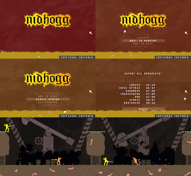
Nidhogg

It's a good way of indicating to the player that it's an interactive thing and a good way to make the player feel good just by the menus. It also functions as a way controller players to know what interactive thing they're interacting with (since they have no mouse it's more ambiguous)

The games also both use audio as an indicator of intractable buttons too. Nidhogg more subtely than Lethal League.

The menus reflect the type of game too. Lethal League, being a game about excitement and speed has very punchy menus that can be navigated quickly with both mouse and controller. The audio ramps up in intensity as the player gets closer to the actual game, with loud announcer sfx when the player chooses a character to make them feel really good and pumped for the game to begin/

Nidhogg on the other hand; a game about strategy, mind games and technical skill, has much more chilled out music and menus to match. The themeing of the game is established with the visuals and the menu navigation is not overplayed as the focus is intended to be on the game itself and the zen like mind set it requires of the player.

I want to go for more Nighogg so far as sound effects and juice because I want the players to get into a more thoughtful mindset and it suits the underground mysterious planet theme of my game.

Layout wise though I'm going to go for more Lethal League because I like how easy it is to find where you want to be and if I want players to play my game a lot, I have to make sure the UX doesn't limit their enjoyment of the game.

Developing menus with controller in mind is trickier because making a system where the game knows what comes next in a sequence (when moving down through a list of options for example) can be difficult when I'm constantly going to be shifting things around. So initially I'm going to develop the menus with mouse in mind and then add controller support once the layout/UX is established.

Saturday 12 November 2016

YEAR 3 - BA3a - SpaceNinja - Some New content

It's not a lot but I've added a new themed area to the game, The Molten Core. This is still placeholder art for the most part but it gives an idea of what I'd like the feel to be. The goo down the walls is functionally the same as the green goo showed in the other gifs but recolored so as to fit the theme.

The lava is a bit more forgiving than spikes in that it deals damage incrementally rather than killing the player outright. This suits the style of level because it allows me to place it all over the map without it being a frustrating way to die. I use it a lot in this design and the player is constantly at risk of being damaged by it. This map has safer areas but only for short periods of time so the players must always be on their toes.

I like the design of this map because the shape of it, and positions the players might want to exploit move around a lot during a single round. The players both have areas behind the goo (which reflects bullets) that they can use to hide, but only for very short periods of time as their hover meter is only half a second and they risk damaging themselves in the lava. The cracked blocks in the middle fall down when stood on which opens up the X-wing shaped section to be shot through (but not moved through), which in turn, causes the lowest platform level to come under pressure because bullets can now reach it from the opponents side. This makes the personal 'hiding place' much less safe as a result.

The platforms that fall down also serve a second purpose. Whilst making the top section more dangerous, the bottom section becomes less dangerous as there's now more area to stand on. but due to the lower resting point (inside the lava), the platforms also serve as a way to get to the same level as and destroy the 2 rubble blocks on either side which from here can be shot and destroyed to trap players down there. Due to the arrangement though, it's only possible to trap yourself, not your opponent, which allows for some interesting mind games between players.

Also, the fallen platforms make the map much more vertically oriented, which increases the viability of jumping on players heads over shooting them. Overall, the map has a lot of dynamics which I think make it a relatively high skill map to play on.

I made this map to test out a new block design; the brown one in the middle. The gif actually doesn't capture it particularly well but the blocks are ones which, require both the skill to hover and shoot at the same time since a bullet is required to flip the spikes from one side to the other. I think they're particularly interesting regarding player vs player because they allow players to shoot eachother from different heights (which cannot normally be done). They also allow for some sneaky tactics, which will result in a wider degree of playstyles. This is a good thing if I want a healthy player base as it let's players express themselves through their play styles. I also have an alternate version of this block with a timer that causes it to reset automatically but I think that works better in PvE rather than PvP to be honest.

Saturday 5 November 2016

YEAR 3 - BA3a - SpaceNinja Initial Testing

It's been some time since I've tested the game. The last major round of testing I did was whilst the game was still a single player metroidvania. That's not to say that some of that research can't go into the current game, since it is still essentially the same movement and basic combat. I do need to test the new balancing though, that is that no one approach feels too powerful relative to another. That would be a problem as it would condition the players into a particular optimal play style that would limit the overall diversity of approaches the game gives the players.

The main feedback I got from a round of testing with friends:
1.Players using the controller don't slide on ice
2.When you can just jump on the enemies head it makes the sword feel a little bit useless as a weapon
3.There needs to be an easier way to switch between levels

For the most part people seem to really enjoy the game and it seems to go down well as a 'spectator sport' as the response from observers is positive too.

Response:
1. This is just a bug that needs fixing. I've noticed it before but it's actually more difficult to fix than it would seem due to the way I've programed left and right movement with the controller. At some point I might 'standardize' movement so that there are different set speeds to walk, run and sprint/ dash. This would allow me to give the keyboard players the same degree of movement as well as make it easier to fix the 'ice bug'.

2. I think it's very important that the game keeps the ability to jump on the opponents head as a way of dealing damage because it makes height advantage and actual advantage. The struggle of trying to dodge your opponents shots whilst navigating above them whilst gravity is trying to pull you back down is one of the interesting things about the game. It incentivizes moving into close range and getting the 'sneak attack' on your opponent and just generally promotes healthy movement around the stage. That's the reason it kills in 1 hit too (rather that 3 hits); because I want to promote movement and offense as opposed to turtleing/ defense.

I think the reason people feel like they should be able to deal damage with the sword is because it's thematically a weapon but mechanically a shield on cool-down and that causes a disconnect for the players. I think it would be smart at some point to re-design the sword as some kind of magic shield or something so as to more closely fit the theme and function.

3. This is a good point and one that I've neglected to some degree in order to focus on the mechanics. I'll look into implementing some kind of system that allows the player to switch levels after a round or possibly different game types that do their own things with level select (loses picks for example). Before that I need to develop a proper level select though.

Thursday 27 October 2016

YEAR 3 - BA3a - Task 3 - RNG chest

I couldn't decide which task I wanted to do more between making the chest and making the RNG for it so I did a bit of both.

On the left you can see 2 of the potential drops from the chest. I have 3 possible drops and the chance of receiving any of them is equal and decided as soon as the chest is spawned into the world.

I wanted to focus on the experience for the player so I put emphasis on the visual effects of the item coming out of the chest with lights and spinning to make it feel good.
I also wanted the chest to be easy to interact with so I tracked the players view point and created a visual indicator when they are in range to open it and looking at it. This way it is not ambiguous whether or not the player can open the chest or not.


The chest itself is 4916 triangles as per the brief and contains beams and grooves along the middle on which the lid slides back (as seen in the above gifs).


Wednesday 26 October 2016

YEAR 3 - BA3a - SpaceNinja current state


This is SpaceNinja in its current alpha state. It's the game I've been working on, on and off for about a year and a half now. The game has gone through a LOT of different iterations and genres. Arcade, Arcade 2 2 player arcade, 2 player brawler, single player platformer, co-op platformer, metroidvania, and finally it's back to being a 2 player brawler but with the artstyle/ theme of the metroidvania.

I should note that the music I'm using in the game is placeholder music from Super Metroid and not music that I made. I use it mostly for keeping a consistent 'feel' to the games theme/ art whilst I'm developing. You can mute it with the 'M' key.

 For my project I'm going to finish off the game to a state where I can release it as a commercial product. I'm going to market the game and test it at meetups with NIGD and at events like NGF and EGX. I'll also develop promotional videos and advertisements for the game.

The game currently has almost all art assets and movement in place and basic scoring that tracks how many deaths each player has. I'm going to work on changing the scoring to allow for more variety in levels as currently the same one is just repeated. Generally I'm happy with where the game is at though. The movement is the result of hundreds of hours of iteration. I might also consider re-adding the 2 block high character to the game since it adds more strategic depth to the game. The only downside is how much more difficult to control it is. I might have to do some testing regarding that...

Monday 17 October 2016

YEAR 3 - BA3a - Task 2 - Projectiles

Task:
Survival Weaponry.
An epidemic has broken out in Chicago leaving a section of the city cordoned off, under quarantine, and those stuck on the inside fighting for their lives. With limited supplies and an increase in crime, you are left to forge your own weaponry from everyday items to protect yourself. 

Indie Dev.
Using a premade model or your own, create two types of projectiles in UE4. You must consider how much ammo will be lost and how it affects the user.


Response:
I made an arena with a game in mind to test out my weapons. Obviously the rest of systems determine a huge amount about what makes an interesting weapon. For example, a gun with an extremely long range is no different from a gun with a short range if the size of the game space is small, or a weapon that you can drop off heights has no value if the environment is completely flat. Furthermore, the ammo usage of a weapon is entirely dependent on how frequently the player is able to acquire new ammo in the game. The design decisions I made about the weapons are based on the arena and game I made for it, as without this context I have to make HUGE assumptions about the scenario I'm designing for.


The game I made is essentially an FPS that pitches 2 players against each other in a small arena. Each players goal is to get into the opposing base and destroy its core whilst preventing your opponent from destroying yours. If you get killed you get reset at your base after a short period of time and your ammo is reset in your own base. The game has 2 different classes; defense and offense, which the player can switch between at their own base. Each projectile was made with only one class in mind.

The arena I made is relatively small and includes various routes over 2 main heights whilst remaining mostly symmetrical. It also includes small passageways which can be easily blocked off/ guarded and some special shortcut options only available to the offensive class.

The defensive class's first weapon is a t-shirt gun with a lighter on the end that fires tennis balls containing vodka. These projectiles move slowly so can be shot over walls/ledges and bounced a little around corners. They make good use of the verticality in the area. They can be used to kill the opponent as well as crowd control to block off small passage ways. They have a relatively high ammo cap due to their difficulty to hit and crowd control
usage.

The defensive class's secondary weapon is a backpack full of rolled up sheets of aluminum (into cones). They have a very short range and can be dropped from height where necessary. They stick around for a little while and cannot be jumped over from ground height. Initially they could but I made them taller to avoid ambiguity which I felt could lead to frustrating deaths. The secondary weapon for both classes has infinite ammo because I wanted to incentivize idea of the game revolving around creative movement and impeding of movement.


The offensive class's first weapon is a nail gun with only the capacity for 4 nails. It can reach across the map almost instantly and doesn't drop due to gravity. It kills instantly but requires great aiming and skill to consistently pull off. I wanted the offensive class to have to really consider their shots to give them a high satisfaction of hitting them and to give them a different flavor to the defensive. I also felt that skilled players would be too strong with too many nails.

Their secondary gun fires inflatable storage containers that can be used to block off small doorways and stood on to creatively traverse the map. They take a while to blow up though so the player has to think carefully about how to most efficiently use them and what size to use them at. Large cubes can also be used to bypass spikes placed by the defensive class.


Monday 10 October 2016

YEAR 3 - BA3a - Task 1 - Finished Hallway

The hallway starts with a 20 second elevator ride. I wanted to create the impression that the hallway was in a remote location so I imply that the player is far from ground level. This also gives the player time to get a feel for the controls and most players will try to click the buttons during this time because they have nothing else to do. Although the buttons have no function, they do react to the player clicking on them. I did this to teach the player early on that they can click on things in the game because it's an important function used later on.

The first thing the player sees when the elevator doors open is basically pitch black. The lighting from the elevator shines out onto the walls to let the player know that they only need to walk forwards. I intentionally left a fairly large gap between the elevator floor and the ground because I want the player to feel uneasy walking over this gap and into the dark hallway.


The window with bricks is a nod to David Lynch's Eraserhead and I use it few quite a few things. Firstly it acts as a visual marker in the pitch black to allow the player to judge their bearings. It also acts as a dim light source which can only be seen from the blue room causing an inconsistency in the players mind as well as making the hallway more visually interesting the second time through. It's also intended to make players uneasy (especially ones with a history of horror game), since it's a space where something could jump out at you when your back is turned. Many players walk backwards away from the wall. Finally, I was hoping the absurdity of a window leading directly to a wall should put the players on edge. A bit like how the hallways don't link together in a reasonable way in Stanley Kubrick's The Shining.

There's a piano (downloaded a royalty free model) in the hallway that is a major set piece and requires interacting with to progress. To make this clear I've raised it up to bring more attention to it. I also try to teach the player that they can interact with things by making the buttons in the elevator pressable in the long sequence in the beginning. I've tested the game with 2 different people who don't normally press games and both of them have figured out fairly quickly that they can interact with the piano.

After touching the piano the door previous swings open. I was considering adding a swinging sound effect but because of the obvious light difference every one has noticed fairly quickly. I made sure the door opened in such a way that it didn't obscure the players view of the light from the blue room.


This door leads to the second part of the hallway which has another major color change. Once the player is inside, the door swings shut and piano music starts to play (Funeral March, Op. posth. 72). Because the player already knows where the piano is, this music gives them the goal of finding the piano again to find out who is playing it.

This part of the hallway has a very dark section and I've hidden a trigger box in it that teleports the player into the dark part of the other bit of the corridor. This allows the player to escape the room whilst playing with their sense of geography.

When the player gets back to the piano the elevator opens again allowing them to leave. I give the player the choice of messing with the piano a second time for a bit of an 'alternate ending'.

Given that the player has no other direction to go in here, they eventually find themselves back at the open elevator where I restart the level.

Throughout the hallway I'm trying to imply some kind of narrative about this huge man and possibly some kind of water related death but honestly that just sort of developed as I was making the hallway and was not planned from the beginning.

Thursday 6 October 2016

YEAR 3 - BA3a - Task 1 - Level Design

I've been thinking about what to do regarding audio for the hallway and I've been collecting audio from freesound.org. I've also been recording my own audio.
I've made the players walking speed a fairly realistic slow walking pace because I can use it to create tension as well as making the player feel more in the characters shoes so to speak. I've also recorded a stepping noise and used variations on the noise to create real sounding stepping sounds for the same reason. I also intend to fake out the player by creating stepping noises from around corners etc
Another reason for the stepping sounds is to subtly cause the player to pay more attention to the audio, since I'm intending to use it a lot for guiding/ scaring the player.

I watched a GDC talk recently by Brendon Chung on Youtube recently called How to Tell Stories and Guide Players through Level Design and he talks about using things like buttons to force the player to look in a certain direction so you can do things behind their back, so I've included the ability to interact with certain objects in the scene so I can put this to use.
He also talks about making the geometry easily readable by putting bends at the ends of corridors and not hiding important passage ways behind sharp corners. However, since part of this project is about disorienting the player (whilst still guiding them through a space) I actually have hidden a passageway around a corner in the dark because I don't necessarily want the player to notice it on their first time walking past.
I do use light at the end of a hallway trick though because I DO want to guide the players in that direction.

Tuesday 4 October 2016

YEAR 3 - BA3a - Task 1 - Theme

I'm only intending to grey-box the hallway for this project with basic textures for the walls but I still feel like it's important that I have some kind of theme or if this hotel is set in the real world, a decade. The reason for this is because the theme determines so much about the layout of the hallway, the context for why the player is there, and the visual and audio ques I can use.

considering this hallway is a place once lived in it's tempting to go for the 1920's, given how lively everything was back then and the jazz/ swing music of the time elicits a feeling of age. My biggest concern is how cliche it might seem given how popular that time period is in current media (Fallout, Bioshock, etc).

One route might be to set the game in the future and have 'the past' as the current day. Perhaps I can reveal this in some kind of twist ending.

Here are some pictures of atmoshperic hallways I collated. Generally speaking the more lavish looking hotels seem to have wider hallways, more use of reds, carpets, seating and wall mounted pictures. The more 'atmospheric' looking hallways seem to generally have mostly unnatural light, generally darker 'mood' lighting and lots of variation in width, where small passages lead off to more doors etc.

YEAR 3 - BA3a - Task 1


By their very nature, hotels are designed to teem with life but
when business dips and owners can no longer afford to keep the
doors open, the building’s inviting atmosphere dissipates.
Lobbies once choked with people become yawning and shadowy.
Wandering down hallways with darkened rooms flanking either
side becomes an exercise in courage. In these places, the mind
plays tricks, inventing footfalls, laughter, and snippets of music
from a bygone age
- or perhaps some guests really do never
leave. 


My first task of the year is to create an atmospheric hallway with this description. As a games designer/ indie developer my goal is to make what is essentially quite a small area into something interesting to traverse despite limited traversal options. To do that I'll be guiding the player using audio, lighting, level geometry, and I'll be looking for interesting ways to reuse the same space. Where possible I'll be using lots of tricks to keep the player on their toes and to imply some kind of narrative.

Thematically I liked the idea of the 'infinite hotel' also known as 'Hilbert's Paradox of the Grand Hotel', which is an infinitely large fictional hotel used as an aid in describing the notion of infinity. I figured a hotel of infinite size would have it's own ecosystem, transport, leisurely spaces and due to it's infinite size would also contain entire fields, cities, continents, and planets. Which is why I think I've concluded that it's actually quite a bad theme for this hotel; it has no direction.

But I do like the idea of an impossibility space. Corridors that link back to themselves, architecture that makes no real sense, walls that shift and change shape. It also got me thinking about a game called Bernband by Indie developer Tom Van Den Boogart. A large part of this project is the atmosphere and in Bernband, the real atmosphere comes from the feeling of existing in a real world. The Bars scattered around, the sound of people making their daily commutes, and the quiet spaces away from all the noise.


For my hallway I can't have people walking around as it goes directly against the brief, but I can certainly trick the player by playing audio of what once was there, and make them feel like they're living in a real space by building it as if people really did live here.

Here are a few initial ideas:

Audio:
Footsteps that mimic yours
Music from within other rooms
Traffic from outside
voices that mock the player
Scuttling sounds

Echo, reverb?

Visual:
Dim the lights
Put the lights out
Change the time of day
Fake flooring/ walls

Ludic:
Change the players height
change the players speed
Loop the hallway back into itself
Change things behind the players back

Thematically I'm still a little bit stuck and I'll cover that in the next blog post.

Thursday 21 April 2016

YEAR 2 - BA2b - Evaluation

Both Programming and Designing a game whilst Managing a team of 5 people for 6 weeks has been tough. There have certainly been times when frustration was high with people not doing what I'd asked and there were times where I didn't do things when I said I'd have them done for. I feel like the game itself is good though. I do think mechanically this game is lacking in areas and I take responsibility for that but the idea itself is very novel and was unexplored territory for me. I've learned a lot from developing this game. Firstly as the manager I need to keep a better track of what everyone's supposed to be doing. I did experiment with Trello and I probably should've stuck with it throughout but that's a lesson learned for next time. We did make good use of the Slack group I set up though. As a designer I think the concept was a good choice because it gave everyone on the team a potentially infinite amount of work to do so no one should've felt like they had nothing that they could be doing but it also didn't need TOO much to actually function. So the scope was flexible. One problem with the design is that it required a lot of foundation code in place before I could really call it 'playable' and by that time we were far through the project. So player testing was limited. We honestly didn't even get the point where testing would have been particularly useful because the systems never got to the point where they interacted with eachother enough and I had enough on my plate to work on throughout. Perhaps the game was overscoped slightly. Me and some other team members have agreed to carry on working on this game after hand-in because there's still more work we want to do on it and it gets exponentially better every time we add something new.

As well as what's previously mentioned I modeled, textured and created 2D artwork for the game where it needed doing. I feel like I distributed work evenly throughout the team who, also did work of their own volition. The ideas, documentation, assets and concept art I received that I didn't ask for were some of the most useful and contributed greatly to the project.

I did a lot of work for the team during the cross course collaboration. I was a big part of any discussions we had and I developed 2 interactive demonstrations working with other members in the team. I stayed back late in university working so as not to hold up development at any point during development.
YEAR 2 - BA2b - Behind the scenes

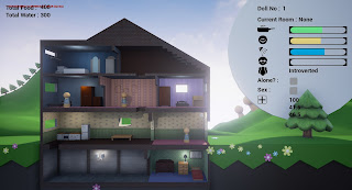
I did a lot of little things to the scene to make it feel as rich as it does that probably won't get noticed by a lot of people. This is what the landscape looks like from above. There are huge white blocks below the ground in particular areas to control the intensity of the sun at different times of day.


The arrangement of all the trees on the horizons took ages to get right and only look correct from the angle the player will see the game. This was all done through trial and error.

Another trick I put in the game is to have the sun do an 8 shape in the sky rather than a normal circle. Imagine the cross in the middle of the 8 is above the players head and the rest of the 8 curves around the earth. This allow the sun to light the house from all angles whilst it's in the sky but more importantly, it lets the player see the SUN RISE AND THE SUN SET on the same side of the screen.

https://youtu.be/PhM7xZJlPj8 - Watch this video. You can see that the sun spends a lot longer in the sky making the days longer. You can also see the sun rise and set on the same side of the screen.


The way I fixed the issue with the dolls jumping around too much when you try to move them is with an invisible wall that sits inside the house. This keeps the cast ray hit point at a fairly consistent distance from when you initially press down meaning there aren't as many sharp jumps in distance making for smoother doll movement.

YEAR 2 - BA2b - JukeBox

The Game having a jukebox is something that was discussed from the start but it's something I've not really been able to implement until now because I didn't have the foundations in place to allow it to affect the dolls in the way I wanted it to. We discussed having the UI change into a playlist with a choice of music when the player clicks on the jukebox and the player was going to be able change the music here. They would also unlock new music by doing different things in the game (but time).

So the way the jukebox works in the game currently is it just switches to the next song in the sequence when clicked on where 'no song' is in the sequence.

the jukebox acts as a way for the player to change the music during the game and they can use it to control how the dolls are feeling when they're in the basement. This means that as the player progresses, gains more knowledge and unlocks more songs, they have more control over how the dolls behave and they can use this to enact specific scenarios. This should allow the player to acquire a greater feeling of accomplishment the further they get through the game.

https://www.youtube.com/watch?v=81fjoAsoj3E - Follow this link to see the jukebox working

Wednesday 20 April 2016

YEAR 2 - BA2b - Ghosts, Gravestones, Facial Expressions and Rare Hats

https://youtu.be/9DNcQQS90YY - Go to this link

So I've just implemented souls into the game. When a doll dies their soul becomes a ghost and flies away. Occasionally if a doll is particularly immoral, their ghost sticks around and haunts the other house mates (Not implemented yet). I also plan to allow dolls to capture souls and reincarnate dead dolls or sacrifice them to Lucifer in return for rewards but I don't have time to implement this before the deadline.

Players can place dead dolls in the back garden to bury them and a gravestone will appear in their place.
There's a picture of a dog in the kitchen looking out towards a gravestone. I'm using environmental story telling to imply that the dog is buried there. I'm also using the placement of the gravestone to imply to the player that they have the ability to bury dolls there.


I've also made expression to give the dolls. The plan was to have these expressions quite extensive and unique to each doll but we ran out of time. Currently all the expressions do is show how happy the doll is.

I made all these doll faces. I tried out a few in game but I chose the ones I did because they were the most expressive. I decided the one with the open mouth was too goofy. It is important that the faces are expressive because they are difficult to see from how far zoomed out the camera is. In game they are still hard to see and when I carry on with the game after the project is over I'll make sure they're easier to see.


Still though, I feel like the doll faces bring a lot to the game. It's easier to sympathize with the doll faces. I found myself feeling bad when I made the dolls sad. I think they would have been even more powerful if they each had their own individual face types.

In order to make the dolls more individual I asked Ben to model me some hats to give the dolls.

I made it so the dolls have a rare chance of starting with the hats. This is because I wanted the hats to be somewhat of a rarity. I think it's exciting when you happen across a rare occurrence in a game and it's the kind of thing that players share with their friends and over social media which is obviously good for the game.

Tuesday 19 April 2016

YEAR 2 - BA2b - New Background and Dialogue Box


Most of the assets are in the game now and It's looking really nice. We were discussing whether to have something behind the UI so it didn't blend into the background too much and I trialed a few things. We figured that we'd risk blocking out too much of the background by putting a box behind it so it was decided we'd do something with the mountain.

I tried emulating a 2D UI box by placing one physical one in the level and it looked pretty cool but a bit out of place. In the end we decided just to have the mountain rise incredibly high so as to surround the UI.

Also, ever since implementing the day/night cycle the lighting on the house has been FAR to light during the night, but I'm happy to say I finally found a solution.

I placed trees going up the mountain very carefully so as to follow the very edge of the horizon. This was to give the game more character and to make the mountain feel less slapped on. It was important that the area just to the right of the house was left free because that's where the sun sets and I wanted players to see that. Suddenly it feels like the dolls are living in a fleshed out, breathing world.

I've been experimenting with a dialogue box that describes what dolls think of eachother or just generally giving more clarity to what's going on in the house.

Unfortunately the compression on this gif is very high but what's happening is, as the dolls are eating above a certain food level, the dialogue box is telling the player which doll is too full.

I would've extended this concept to more things in the game. It could've had it's own quirks and give hints when not much is happening. I couldn't get it to work how I wanted though. ALMOST but not quite so I've scrapped it for now until I figure out how to get it working how I want. (Basically if there was more than one thing to talk about at once it would always prioritize the earlier in the array first and I wanted it to choose a thing to talk about randomly) (I could swear my code should work in theory! But maybe there are still thing I don't know about how UE4 handles arrays).

This recorded this gif to show cannibalism since I didn't actually show it in my last post

YEAR 2 - BA2b - Day/Night Cycle, New UI, Sex and Mingle, Cannibalism

Since the last post a lot has changed.
- Firstly, we now have the doll assets in the game with clothing that changes depending on the situation.
- I made a day/night cycle that currently is just aesthetic but I'm looking to sync it with how hungry/ tired the dolls are and with specif event too.
- Dolls now lay down when they're placed on a bed and if two dolls like each other enough they'll have sex (which raises their happiness drastically but lowers their hygiene drastically), they also start to like the other doll even more. This would be an unlimited resource of happiness however they won't sleep together if one of the dolls is unhygienic and they'll start to dislike eachother if they spend to long together. Since water is a limited resource, so is sex.

Initially I made it so that the dolls could have sex even if they didn't like eachother and that would make them dislike eachother even more. However, it felt wrong and pretty controversial to leave that in the game so I changed the code to make it so the dolls just lay next to eachother sharing the bed. I do think that controversy isn't inherently a bad thing but it's an area you have to approach with caution and I don't feel like I can give it the caution it deserves with the time we've got remaining.

The dolls get little hearts above their heads if they're going at it. They also remove their clothes. They also remove their clothes when they're alone in their room normally.

Side notes - I made the table to their right and I'm pretty proud about how it looks.
- The bed has a 50% chance of spawning as a different bed made by a different member of the team.


I actually trialed having a hand drawn 2D background that would animate with the time of day and I tested it out with an image in game. It looked okay but getting it looking good was a big responsibility and no one on the team had a particularly strong background in animation.

Next, I made a huge day/night circle that would spin around based on the time of day. This looked good but not incredible. With a dedicated artist working on it and putting little markers around the edges with the time on I think this could have worked well.

What we actually went with works best I think. I was doubtful of how good it would look initially but using UE4's inbuilt landscape editor (and a keen artistic eye) has turned out really nicely for us.


I think it needs some more work but the way the shadows roll across the hills as the sun moves overhead looks really good and it allows us to do loads in the background for the events (zombie uprising, thunderstorm, plane crash, etc...).

You can also see from this image the new UI Connor made for us. I think it helps to show how the dolls are feeling at a glance. A new variable that I've added is HP too. Currently this only goes down if a doll eats part of another doll in return for HP (cannibalism) (The eaten dolls fear will increase and their likeness for the doll that ate them will severely decrease) (The doll that ate the other doll will lose morality and this increases their chance of doing immoral things in the future). Cannibalism only occurs if a doll is very hungry and in the room with another doll. Lower happiness and higher fear contributes to a hidden variable called 'Irrationalism' and this + low morality increases the chance of cannibalism.

https://www.youtube.com/watch?v=QHTCUcsFSbY - Follow this link to watch a video of the game in action in it's current state.

Friday 15 April 2016

YEAR 2 - BA2b - New Assets and Intereactions

The ground needed modeling eventually and since everyone else was busy making assets to go inside the house I figured I'd make it. It kept the poly-count fairly low and the colours simple. I think the simple style looks nice and fits with the theme of the game. The idea is that we'd model a few basic assets that could then be placed on top and around the ground/ garden to make it look and feel more interesting and genuine. I took inspiration form Little Big Planet since the handmade style is similar and the way the ground is kind of a cross section is the same.

The flower is one of the assets I was going to replicate to make the ground feel more alive. In game I added a code  that would randomize its colour on spawn. I also made this as an example of what I was looking for from the team in terms of assets and style.

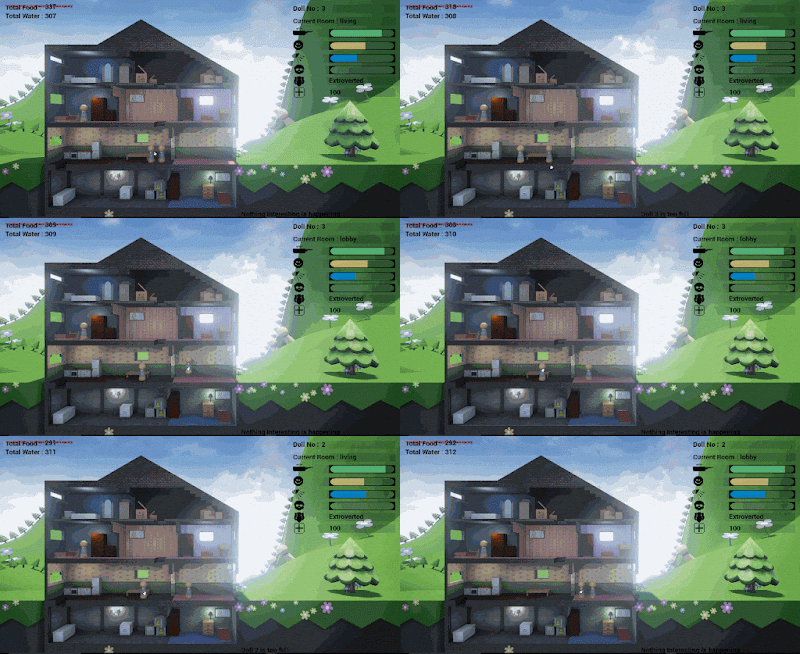
The two number under the UI represent each dolls 'likeness' for each other doll. You can see in the gif how Doll 2's likeness for Doll 3 is going down because they're spending time in the room together when Doll 3 is unhygienic.  Also, Dolls can take showers now to increase their hygene.

Dolls likeness for one another will affect certain actions they take. I will implement that next.