I want to incentivize movement and action in Alien::Qualifier so I design the levels to try and encourage this as much as possible.
I try to stick to a specific set of rules when designing maps:
1. Generally I don't like giving players blocks in front of them when they're standing on ground (map 3 is an exception) because it gives them a safe place to hide and wait for the opponent to approach. Map 1 has ground that allows bullets to pass through it in the middle. This allows me to create an island at ground height without giving players too much cover.
2. The only situation where I do allow cover like this is when there is an easy way to get the drop on the defensive person such as in map 3. Due to the landing on heads mechanic, and the limited air jumps, the most powerful areas are the highest points.
3. I try to always give at least 2 points at the highest altitude so that both players have the option to pressure one another. map 2 is an exception because the highest point has ground directly above it, so a single reflected bullet coming towards them forces them off the platform, which is now available to the attacking player.
I particularly like map 2's circular structure. In play tests I've noticed players move around a lot on this map, constantly trying to exploit the high ground on top of the floating island whilst using the island itself as an areal shield. I also think visually it's one of the more appealing maps to look at and understand.
I like the endless pits in map 1 too because it always feels really skillful to drop into a hole, hover, and jump out again to avoid a bullet. It definitely requires more technical skill though and can lead to lots of accidental self-destructs so I'm generally going to avoid putting endless pits in the caves given that they're intended to be the easiest maps.
I've been looking for music for a little while now, and the first person I messaged never got back to me but the second one did, and said I could use his tracks in the game. MrNightVarga on Newgrounds. I wanted something that was sci-fi but upbeat atmospheric. I didn't want to distract the player but I also wanted the music to bring a sense of place to the various areas in the game. MrNightVarga's tracks are the closest I've found so far.
Fragile Machine
Celestial Enchantment
Red Reflection
Bumpy Wheel
Hi, my name is Louis Protano. I'm a game developer. I'm also a student at Norwich University of the Arts. This blog documents my work as I progress through my time studying Games Art and Design.
Labels
- ba2 Iteration. (17)
- ba2 Life Drawing (4)
- ba2 Research (10)
- ba3 (17)
- BA3a (17)
- BA3b (22)
- DollHouse (13)
- NeonParasite (45)
- project 01 - The Tinderbox (15)
- Project 02 - CS (6)
- Project 02 - Gargoyles (29)
- SpaceNinja (10)
- Specialism (13)
- Task 1 (4)
- Task 2 (1)
- Task 3 (1)
- Task 4 (1)
- Y2Ba2a (34)
- Y2Ba2b (15)
- Y3 (39)
- YEAR 2 (49)
- YEAR 3 (39)
Sunday, 30 April 2017
Monday, 24 April 2017
YEAR 3 - BA3b - GameJuice and Visuals
To help make the game feel a bit more alive in time for Norwich Game Festival I've starting adding little juicy effects to the game. There are a million talks on this by Jan Willem Nijman, Meshoff, Sos Sosowsky etc... but the main things thay all say you can do to make your game feel nicer are:
- Screenshake
- Destructible Props
- Permanence
Lighting is turned off in this gif to make it easier to see the effects I've added.
I've added SCREENSHAKE whenever a character dies or a bullet explodes. I've also made tiny rocks fly out of walls and drop down from ceilings when a bullet hits a wall (DESTRUCTIBLE PROPS). Rocks also come out of the ground when a character lands. When a character dies they explode and goo flies onto the walls. To add a little more juice I also made it so the player kicks back when firing a bullet. Not only does this make the bullet feel really powerful, it also adds another element of skill into the game.
The rocks and goo stick for the entirety of the round (PERMANENCE).
The game feels a lot better with all of these things in. I've also included the ability to turn them off as they do reduce framerate and at a competitive level they could distract players from performing well.
I also think screenshake improves marketability of the game because it stands out from all the other gifs on twitter when it's shaking around and you can sort of 'hear' the explosion even with no sound.
- Screenshake
- Destructible Props
- Permanence
I've added SCREENSHAKE whenever a character dies or a bullet explodes. I've also made tiny rocks fly out of walls and drop down from ceilings when a bullet hits a wall (DESTRUCTIBLE PROPS). Rocks also come out of the ground when a character lands. When a character dies they explode and goo flies onto the walls. To add a little more juice I also made it so the player kicks back when firing a bullet. Not only does this make the bullet feel really powerful, it also adds another element of skill into the game.
The rocks and goo stick for the entirety of the round (PERMANENCE).
The game feels a lot better with all of these things in. I've also included the ability to turn them off as they do reduce framerate and at a competitive level they could distract players from performing well.
I also think screenshake improves marketability of the game because it stands out from all the other gifs on twitter when it's shaking around and you can sort of 'hear' the explosion even with no sound.
Thursday, 20 April 2017
YEAR 3 - BA3b - Name, Logo, Icon, NGF
It stemmed from the creature face design looking like two colons, [::] and I figured it was quite iconic. There is a programming term for '::' called a Namespace Alias Qualifier and it's essentially used as a pointer to find information within a specific variable. Eg. [ob_character::health] would return the health of the character. The name 'Alien::Qualifier' is a pun on the programming term as the game is about aliens fighting (To find something within themselves?).
I also like the simplicity of the [::] design as it looks quite alien but it's simple and easy to replicate/ modify for other things. Qualities I heard about from graphic designer Michael Bierut. He speaks about it in 99% Invisible (Starts around 4:30).
This is the logo in both black and white versions. It incorporates the :: into the middle to bring attention back to the characters. The typeface I used is called 'Hobo std'. Due to the quirkiness of the characters and due to how I'm trying to bring more lightheartedness into the game as a whole I went for a sans serif. The curliness of the lettering is quite alien and bouncy but it's also bold as if to say 'it's sturdy but fun', which is what the game is; fun and goofy but still very defined and rigid in terms of what the player can do.
The frame around the lettering incorporates the hover bar from the aliens face into the logo but it also looks similar to the shape of the ground in the game so I ran with it and added little bumps and spikes to emulate the environment art.
All exe's have a square icon that you click on to run them. So again, I used the aliens face for the design of the icon. This image shows various alternate versions but the one I went with is number 3. I'm also using it as a twitter profile picture now too.
Here's the logo on top of the caves concept art. I'm applying to Norwich Game Festival as an exhibitor and they request an image like the one above for their website. I tried various sizes and positions for the logo but the one above is the final design and I'm very happy with how it looks.
Thursday, 13 April 2017
YEAR 3 - BA3b - NEW VISUALS, lighting system & background effects
GameMaker has no in built lighting system so I made my own from scratch (I've actually everything in this game from scratch except for the music).
The reason I'm making a lighting system is to try and dynamically emulate the gradients I managed to achieve in the concept art and, by extension, give the scene more depth and mood.
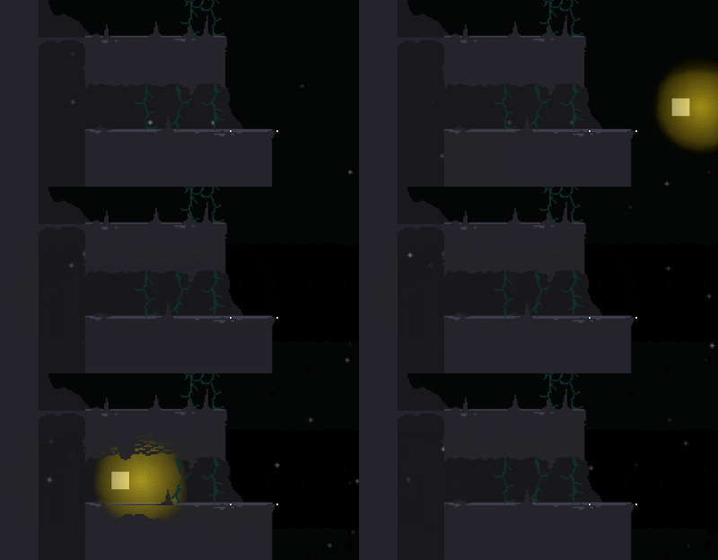 This gif shows my first attempt at a lighting system. It's literally just a colored circle with a fading opacity that follows bullets.
The shading on pieces of ground was flat so in an attempt to give it lighting texture I placed pixels of ground color on top of the ground that draw above the lighting to break it up.
For this system I used a nested for loop to create 8x8 pixel black squares that fill the room.
They change opacity based on their distance to the player, bullets and lights (no lights in the above scene). Because they incorporate bullets and players together as separate sources of light, the bullet creates a kind of mussel flash as it's spawned from the player due to lights in that location being close to both; a happy accident.
One potential issue with this lighting system how inefficient it is, code-wise. For example, this 640x360 pixel room / 8 means it has 3600 8x8 pixel light squares. All of which are calculating their opacity 60 times per second. That's 216,000 calculations per second!
However, the frame rate still stays well above 60FPS on my computer so for now I think I'll keep the lighting engine but give players an option to toggle it off/on (unless I make a better one).
I recently watched THIS GDC VIDEO about the art of Owlboy and one of the things they mentioned (around 7 minutes) is that they started to add movement to objects in the background to give the scene more life.
So to give my levels more depth and interest I made little environmental props that I could procedurally animate.
The squares in the background move up and down and tilt using [sin(N)*(random(60)+20)] where N is increasing very slowly every tick. The amount of vertical movement and total tilt is also randomized but limited by this algorithm.
Also, the number of squares spawned and where they spawn is pseudo-random too, giving each play a slightly different feel, which should improve longevity of the game.
The ground blocks also have random change of spawning a drip if there are no ground blocks below them.
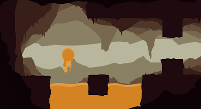 I've also been working on redesigning the Molten Core area.
The molten Core is generally much spikier and dangerous than the caves and the little details in the environment reflects this.
I use the same technique as in the caves concept art to make this piece, for both ease and consistency.
I wanted the molten core to feel much more dangerous so, the tiny squares that move down the screen are blown by a heavy wind caused by lava heat and the huge spikes in the background move up and down to give the feeling of being inside a gigantic, otherworldly monster.
The reason I'm making a lighting system is to try and dynamically emulate the gradients I managed to achieve in the concept art and, by extension, give the scene more depth and mood.
 This gif shows my first attempt at a lighting system. It's literally just a colored circle with a fading opacity that follows bullets.
The shading on pieces of ground was flat so in an attempt to give it lighting texture I placed pixels of ground color on top of the ground that draw above the lighting to break it up.
I ended up scrapping this lighting engine because I came up with a better one
They change opacity based on their distance to the player, bullets and lights (no lights in the above scene). Because they incorporate bullets and players together as separate sources of light, the bullet creates a kind of mussel flash as it's spawned from the player due to lights in that location being close to both; a happy accident.
One potential issue with this lighting system how inefficient it is, code-wise. For example, this 640x360 pixel room / 8 means it has 3600 8x8 pixel light squares. All of which are calculating their opacity 60 times per second. That's 216,000 calculations per second!
However, the frame rate still stays well above 60FPS on my computer so for now I think I'll keep the lighting engine but give players an option to toggle it off/on (unless I make a better one).
I recently watched THIS GDC VIDEO about the art of Owlboy and one of the things they mentioned (around 7 minutes) is that they started to add movement to objects in the background to give the scene more life.
So to give my levels more depth and interest I made little environmental props that I could procedurally animate.
The squares in the background move up and down and tilt using [sin(N)*(random(60)+20)] where N is increasing very slowly every tick. The amount of vertical movement and total tilt is also randomized but limited by this algorithm.
Also, the number of squares spawned and where they spawn is pseudo-random too, giving each play a slightly different feel, which should improve longevity of the game.
The ground blocks also have random change of spawning a drip if there are no ground blocks below them.
 I've also been working on redesigning the Molten Core area.
The molten Core is generally much spikier and dangerous than the caves and the little details in the environment reflects this.
I use the same technique as in the caves concept art to make this piece, for both ease and consistency.
I wanted the molten core to feel much more dangerous so, the tiny squares that move down the screen are blown by a heavy wind caused by lava heat and the huge spikes in the background move up and down to give the feeling of being inside a gigantic, otherworldly monster.
Saturday, 8 April 2017
YEAR 3 - BA3b - Diegetic UI; New character
Based on the feedback I got from the meetup I redesigned the character again to have diegetic UI. In In this concept, the orange is the hover bar, red is health and blue is the number of jumps.
I liked the idea of incorporating the hearts in number 4 into some kind of clothing (jewels?). I also liked the round hover bar because of it's resemblance to a clock counting down, so it feels like it'll be self explanatory to the player.
 I ended up taking the concepts into pixel art because so I can more clearly see how the new UI might translate into the final 32x32 character and this is what I ended up with. This image shows a steady evolution of ideas where the most recent design is on the right. The ring around the face is the hover bar, and the eyes/teeth represent the health. The spikes on the back are the number of jumps the player has. I removed the arms because I didn't want the player to think they can use them to attack/grab/climb. In the right most design I thickened out the spikes because in game they were difficult to see.
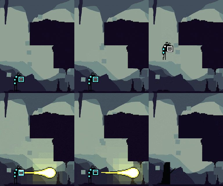 This image shows how the UI would change over time, with full jumps, hover and health on the right and none on the left.
This gif shows the character in game. I'm very happy with it, and in playing I've found it does its job at giving the player the required information.
It does look like it's standing in mid-air though wen still so I still need to update that.
There were a couple of issues with the previous design so I updated the character again to have a more visible hover bar and flappy feet that explain the hovering.
This character looks a lot goofier and confident than the previous one (which looks a bit shy).
This new design is exactly the kind of iconic character I was looking for and it also solves the problem I was having with UI, so I'm very very happy with it.
I liked the idea of incorporating the hearts in number 4 into some kind of clothing (jewels?). I also liked the round hover bar because of it's resemblance to a clock counting down, so it feels like it'll be self explanatory to the player.
 I ended up taking the concepts into pixel art because so I can more clearly see how the new UI might translate into the final 32x32 character and this is what I ended up with. This image shows a steady evolution of ideas where the most recent design is on the right. The ring around the face is the hover bar, and the eyes/teeth represent the health. The spikes on the back are the number of jumps the player has. I removed the arms because I didn't want the player to think they can use them to attack/grab/climb. In the right most design I thickened out the spikes because in game they were difficult to see.
 This image shows how the UI would change over time, with full jumps, hover and health on the right and none on the left.
This gif shows the character in game. I'm very happy with it, and in playing I've found it does its job at giving the player the required information.
It does look like it's standing in mid-air though wen still so I still need to update that.
There were a couple of issues with the previous design so I updated the character again to have a more visible hover bar and flappy feet that explain the hovering.
This character looks a lot goofier and confident than the previous one (which looks a bit shy).
This new design is exactly the kind of iconic character I was looking for and it also solves the problem I was having with UI, so I'm very very happy with it.
Saturday, 1 April 2017
YEAR 3 - BA3b - EGX Rezzed, UKIE Conference
I went to EGX Rezzed and The UKIE Student conference recently, saw some talks and spoke to some developers. In fact I spent almost the whole day at EGX just chatting to other developers and exchanging contact info.
One developer specifically that I spoke to; the Artist for upcoming mobile game, Inops, which has a similar silhouetted ground style to my game. I spoke to him about how he uses a screenshot of the level as a template to draw over in photoshop to create the details in the ground rather than what I've been doing which is to place tiny tiles of pixels on top of my geometry. It's a technique I'm going to seriously consider as the multiple tiles does slow the game down a bit.
I also spoke to Alex Johansson, who was working 'Vaccination', a co-op game where one player has to use a physical wooden syringe to poke drugs into an infected person whilst another person tells them where to poke. We talked about getting yourself known in the industry and starting out part time until you make enough money to go full time.
At UKIE, the three talks that stood out to me the most were:
- Jess Hiders talk about marketing. The main points I took away from it were to regularly post on twitter, which is something I try to do and intend to do more. Use hashtags related to the field #gamedev # indiedev (but not too many) and about what to include on business cards, Name, Twitter, Job Role, linkedin, email, website. I intend to make some sometime soon once the theme of my game is set.
- Fabien Vercuiel's talk about UI/UX design. The main takeaway was that you have to be both technical and creative as UI designers often do a lot of programming and effects too. I should get good at working in a range of styles and making icons. He also told me afterwards about what fonts might be good for my game. He also critiqued my UI and pretty much confirmed that I should switch to diegetic UI.
- Luke Williams' talk about game design. I like his design pipeline. He says to find the most fun thing about the game as soon as possible and to create the game around that core fun thing, which is a philosophy I've been trying to stick to since watching Tom Francis' videos a few years ago. Luke Williams also goes on to say however that difficulty is good because it insensitivises attempts at mastery but it's important that despite this, the game is still silly and enjoyable regardless of skill to draw in new players. This got me thinking about my current game and how I might need to rework some things to make it easier for new players to not kill themselves as my game is currently quite difficult already.
Subscribe to:
Posts (Atom)


