Wednesday 19 November 2014

Project 01 - Applying Composition,Llight and Colour to Environments

This environment piece has many light sources. I've shown the diffused moonlight refracting off the mist and causing soft lighting on the surrounding trees. I've also used harsher lighting on the trees from the firefly spotlights. I've used a range of blues to reds on the trees in order to give the environment a mystical vibe and used mostly blue and white lighting to evoke a sense of cold into the viewer. I've also used thin harsh highlights on the trees imply bark along with softer shadows and highlights to show form. 
I've intentionally composed the image so that the root from the tree on the right leads the eye along itself and up the trees shadow towards the cave


Monday 17 November 2014

Project 01 - Life Drawing

This is a 45 minute sketch from one of our life drawing sessions. The photograph doesn't really do it justice but this drawing was done on A1 paper. I'm fairly happy with how it turned out. It looks better in real life because you get more of a sense of the foreshortening when you're looking at it flat on a table. The proportions are fairly good but I think the hand and arm on the left looks a little too big relative to the hand and arm on the right. Or perhaps the one on the right is too small?

The legs give the image a good sense of depth and I think the pose has a good deal of detail to it. Shame I didn't have time to get the sketch to a point where I'd have been comfortable adding shading.

Sunday 16 November 2014

Project 01 - Procedural Silhouette Generator (PSG)

For Proc Jam 2014, I decided to work more into my random silhouette generator so that it could actually be used a tool for developers.

I've improved the interface hugely and the player now has much more freedom in how their silhouettes turn out. You can download it using this widget:


Saturday 15 November 2014

Project 01 - Rise of the Videogame Zinesters

I read Anna Anthropy's 'Rise of The Videogame Zinesters' recently. It was a very good read. I knew about Anthropy's work previously but this book gave me great insight into her opinions on the gaming industry. She has convinced me that absolutely everyone should make games as a form of artistic expression and it still bewilders me why it's still not accepted as so, at least not as humbly as the art industry accepts film as one of its own. Nevertheless, Anthropy has definitely gained a place on the wall of developers right next to Jane Mcgonigal and Mary Flanagan who I know share similar opinions.

Wall of Game Developers (The ones in red are just work reminders)
I use the wall of game developers to help me to remember visually the names of various developers as well as audibly. I can currently recite about 50 off the top of my head. Obsessive? could be.

Nevertheless, I recommend 'Dys4ia', 'Triad', and 'Mighty Jill Off' as they're my 3 favorite Anna Anthropy Games.

Thursday 13 November 2014

Project 01 - Light and Colour analysis

The contrast between light and dark in this image is very apparent. Immediately you can see that the artist has great sections of dark to push the focal point onto the two figures which stand out from the rest of the image because of their contrasting colours. A lot of blue lighting has been used in the image to exaggerate the coldness of the environment. 


Here, there is a strong contrast between 'warm' colours and 'cold' colours in order to create a vibrant image. You can really feel the warmth of the diffused light rays coming through the tree tops. The harsh reflection in the river acts as a guide to guide the eye upwards and give the piece depth.

Saturday 8 November 2014

Project 01 - Applying Compositions to My Own Environments

In this environment concept thumbnail you can see that I've attempted to combine the 'Iconic' composition in the bottom half of the image with the "L" composition running up the right side and along the top of the image. This focuses the viewers eye up the road in the middle of the image in order to get a sense of the business of the location before moving down towards the figure on the left in order to show the contrast between it's quietness.

Thursday 6 November 2014

Project 01 - Composition Analysis


In this image, you can see that the artist has used the Fibonacci sequence in their composition causing the focus to move around the image in a spiral until it hits the area just above the ladder. The image also has a vague but apparent "L" composition running along the negative space at the top and down the left side behind the hanging apparatus. This composition draws the eye towards the top of the step ladder also, complimenting the other compositional technique.


The artist for this image has used the rules of thirds for their composition. You can see how the pillar lines up with the two points on the left and the transition from light to dark on the wall marks the other two points, with the corner lining up almost exactly on the point. This composition draws attention away from the figure in order to focus on the environment and potentially distracting the viewer from the potential doom she might face. I believe that initially the viewer is supposed to be of ignorant of the snake as the figure, helping us the empathize, causing the image to be more effective in its story telling.

Tuesday 4 November 2014

Project 01 - More Research

I'll be making some character and model sheets very soon along with environment concepts so I've been researching what these should/might look like.

The Witness, Jonathan Blow - http://the-witness.net/news/2010/02/concept-art/


A birds eye view has been chosen in order to show as much of the area as possible in one image. The general colour palette has been chosen beforehand and has been included, perhaps for other concept artists to refer to or perhaps for modelers to refer to. Nothing is completely black or completely white.


 A worms eye perspective has been used here to amplify the height of these steps. There is a noticeable contrast between cold blues and warm yellows causing the image to look very vibrant.

 These less detailed concepts have been compiled in to get a comparison for the overall colour schemes and feel for the games environments.


The Binding of Isaac, Edmund Mcmillen - scans from the concept art book included with the 'Unholy Edition' of the game
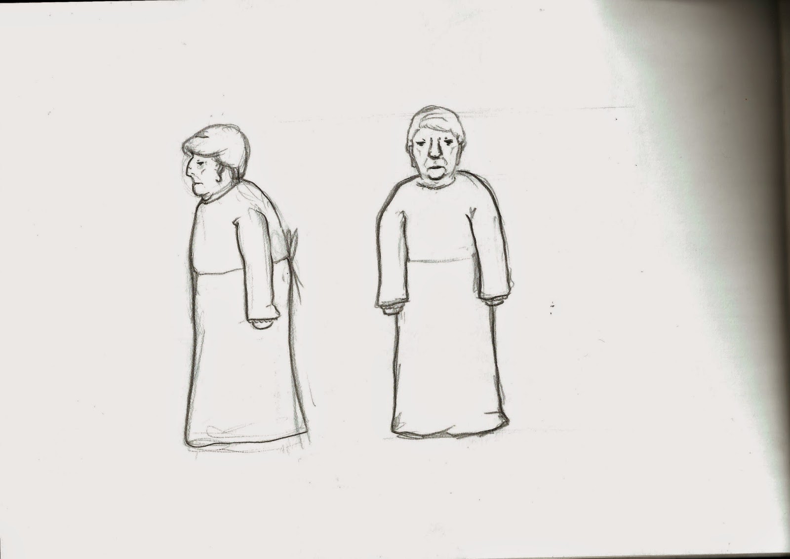
 This early character sheet shows 'Gurdy' at varying levels of detail during various situations. Expression has been used to show the feeling of the character and motion lines have been used to show how the character moves.

The Last of Us - Naughtydog - screenshots from the in game concept art section

An off white background has been used here so the artist can paint highlights into the image. The way Joel and the fireplace break the implied border creates a sense of depth, height and perspective. The piece shows emotion between the characters, showing the state of their relationship to one another.


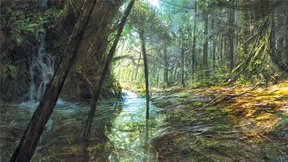
This environment piece shows the state of the city whereby the game is set. The abandoned cars, ripped flags, and excessive foliage strongly imply that the place has long since been abandoned. The acute lighting angle shows that this image takes place some time during the early morning or early evening.

Sunday 2 November 2014

Project 01 - Some iterations

These are all iterations I made on top of my randomly generated silhouettes


I like the pose I've achieved here. The line work is pretty good to. The proportions aren't bad but I can tell that somethings not quite right.
Value. I'm going to keep the hair completely white.


The addition off walls gives the piece a good perspective. I quite like the colours but the walls are a bit plain. My textures are pretty bad. I think I'll consider this piece a step towards a final piece rather that a final piece in its own right.
I think I can do better.

Project 01 - More drawings

Here are some drawings (not from reference) of what I imagine the witch might look like. They were all done fairly quickly.

I was always taught not to do sketchy line work but I honestly really like how it looks.

 The witch is looking particularly suspicious here
Looking more Native American here. That's unintentional.

A friendlier looking witch. She's also a grandmother.


A quick model sheet to get a more well rounded idea of what she might look like

A younger variation on the witch

 I think I'd like the witch to be a jealous maid working for the royalty. Since the rich were RICH, and since a maid would be constantly exposed to all their luxuries, it wouldn't be surprising if she were extremely jealous of their glorious lifestyle.