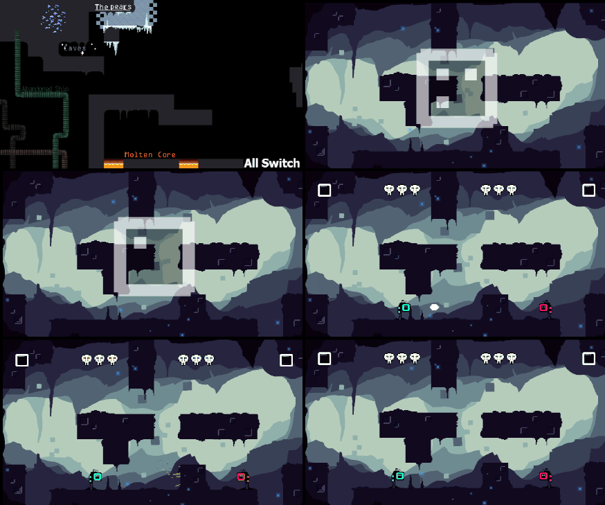
 One of the things mentioned last time I took my game to a NGD meetup was that you could spawn in run into a hole immediately because there's no warning. So in time for the next meetup I made a countdown timer before each round. Again, it uses the [::] motif because I'm trying to make it a consistent thing throughout the game now.
The design also just works perfectly as a timer without any need for localization or anything.
Another thing I changed recently is the reflector now looks more like it belongs to the new character. It works as a short range projectile that takes in to account the players movement, so a fast moving player can move full speed towards a bullet and reflect just in time to shoot their reflector further. The reason they might want to do this is because the reflector can now be used to displace opponents. I love this because it half solves the problem I was having with the highest ground being the most beneficial. This new displacement mechanic now gives the attacking player a much better chance at pressuring the defensive player.
NIGD FEEDBACK:
The game has gone through a huge change since I last showed it off at a NIGD meetup so I brought it again to test out the new tutorial and to see what people think of the new changes made to PvP~
PROBLEM- The countdown timer (the little TV looking things in the top corners) aren't acknowledged.
NOTES - I added these recently but forgot to make a post about them (like lots of things I've added). They track the number of rounds a player has won and count up one by one until they reach 4 and a player is declared victorious. One of the main problems is that they just don't stand out at all. Another is that they look like they can be interacted with but can't. The 3rd major problem with their design is that the count UP, whereas everything else with the [::] design counts down. This may confuse the player.
SOLUTION - What I need to do is, firstly, make them count horizontally rather than like [::] and secondly, I need to make an intermediate room where I focus on the round number actually increasing.
PROBLEM - 5 rounds to win is too much.
SOLUTION - If I make the new horizontal counter variable I can give the player the option to change how many rounds are required for a win.
PROBLEM - In the 2nd tutorial level people can cheat what I'm trying to teach them by dropping down further and exploiting mid-air jumps. Because of this, players get stuck on the final section of tutorial2 because they didn't properly learn the moves I was trying to teach them.
SOLUTION - I need to redesign it to have lava directly below so people can't cheat the tutorial.
PROBLEM - The font in the tutorial is difficult to read, but the button images places around make up for it.
SOLUTION - Find a new font that works well in a low resolution
GENERAL NOTES
- People really really like the new diegetic UI on the characters. Most people found it fairly self explanatory and easy to read. They also like the new character design.
- People like the new countdown timer. "It's really clear what it is despite it looking alien"
- Everyone who tried the tutorial managed to get through it without too much issue or help from me.
- Buddy could do with more characterization in what he says
- There's a bug where the first character slowly slides left and won't turn round but fixes itself after a little while [EDIT, fixed now]

No comments:
Post a Comment