Hi, my name is Louis Protano. I'm a game developer. I'm also a student at Norwich University of the Arts. This blog documents my work as I progress through my time studying Games Art and Design.
Labels
- ba2 Iteration. (17)
- ba2 Life Drawing (4)
- ba2 Research (10)
- ba3 (17)
- BA3a (17)
- BA3b (22)
- DollHouse (13)
- NeonParasite (45)
- project 01 - The Tinderbox (15)
- Project 02 - CS (6)
- Project 02 - Gargoyles (29)
- SpaceNinja (10)
- Specialism (13)
- Task 1 (4)
- Task 2 (1)
- Task 3 (1)
- Task 4 (1)
- Y2Ba2a (34)
- Y2Ba2b (15)
- Y3 (39)
- YEAR 2 (49)
- YEAR 3 (39)
Thursday, 13 November 2014
Project 01 - Light and Colour analysis
The contrast between light and dark in this image is very apparent. Immediately you can see that the artist has great sections of dark to push the focal point onto the two figures which stand out from the rest of the image because of their contrasting colours. A lot of blue lighting has been used in the image to exaggerate the coldness of the environment.
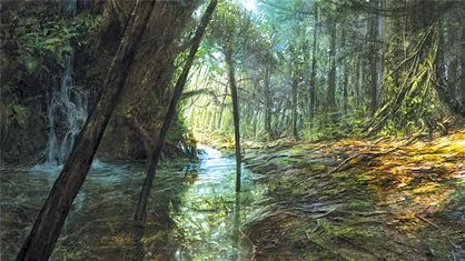
 Here, there is a strong contrast between 'warm' colours and 'cold' colours in order to create a vibrant image. You can really feel the warmth of the diffused light rays coming through the tree tops. The harsh reflection in the river acts as a guide to guide the eye upwards and give the piece depth.

Subscribe to:
Post Comments (Atom)

No comments:
Post a Comment